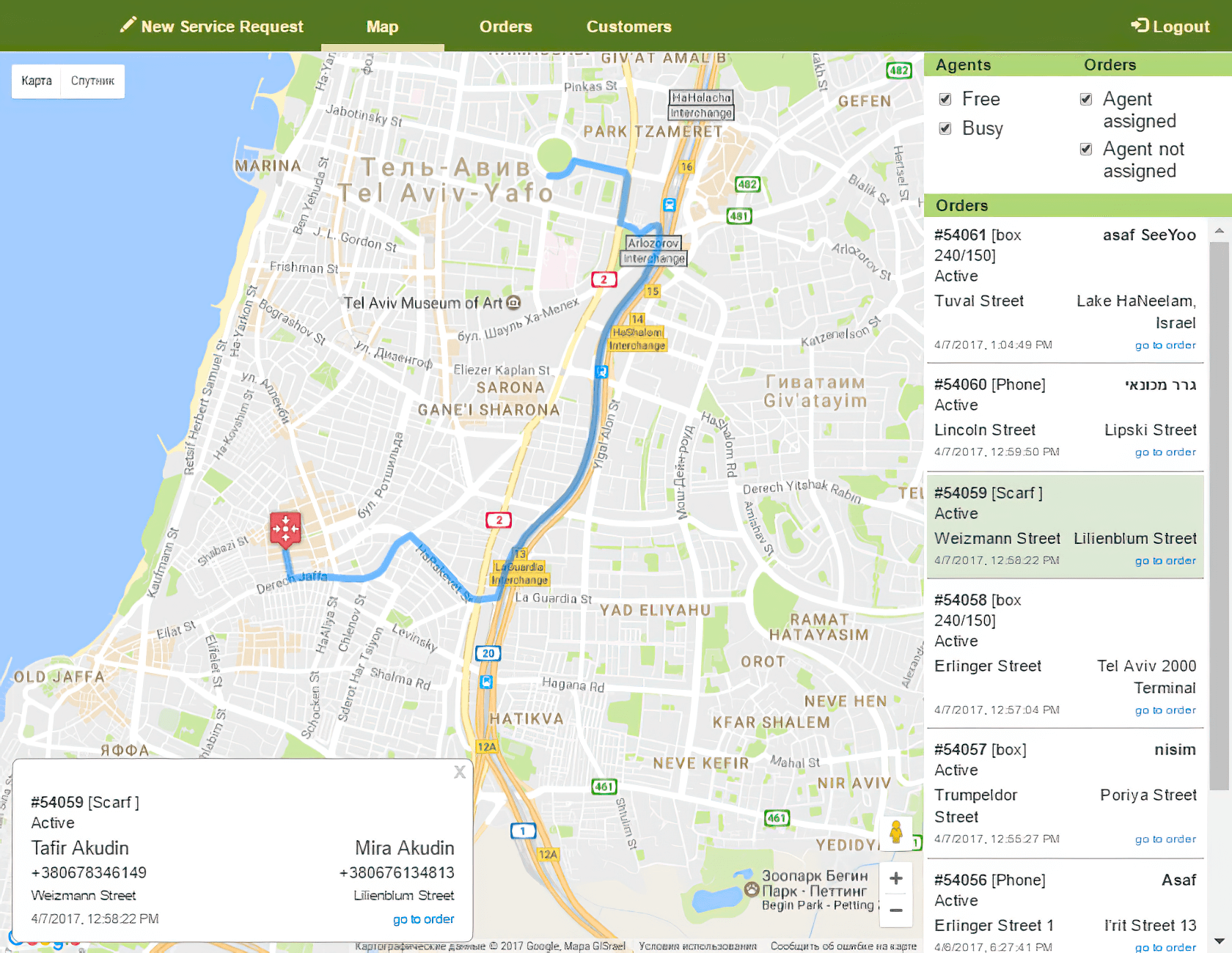
When the customer came to us, he was already in the middle of the development process. He took a decision to create several native applications (one for couriers and the other for managers) to support his business process. This decision was not optimal and led to the expensive development process. At this point, the customer came to us as he wanted the process to be cheaper and faster.

We offered him to make a responsive web application. We considered this option as requirements for the interface in terms of following the guidelines for corporate applications are not so strict. Also, we proposed to create one application instead of two for managers and couriers to simplify the development process.
The project didn’t seem too complicated. And what’s funny, it appeared to be so - that happens not so often.
Before we started, we figured everything about the project and created complete documentation in advance to avoid surprises during the development. We have made mockups, usage scenarios and testing protocols.

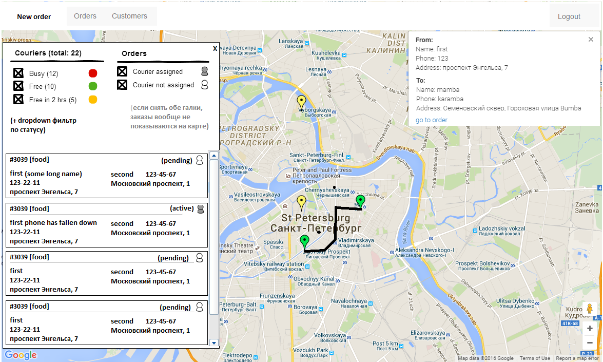
an example of a mocap is apparently very similar to the final application.
We managed to complete the work together with testing and implementation in 1.5 months, which is great for automating the live process with different roles (all this time the service worked as usual).

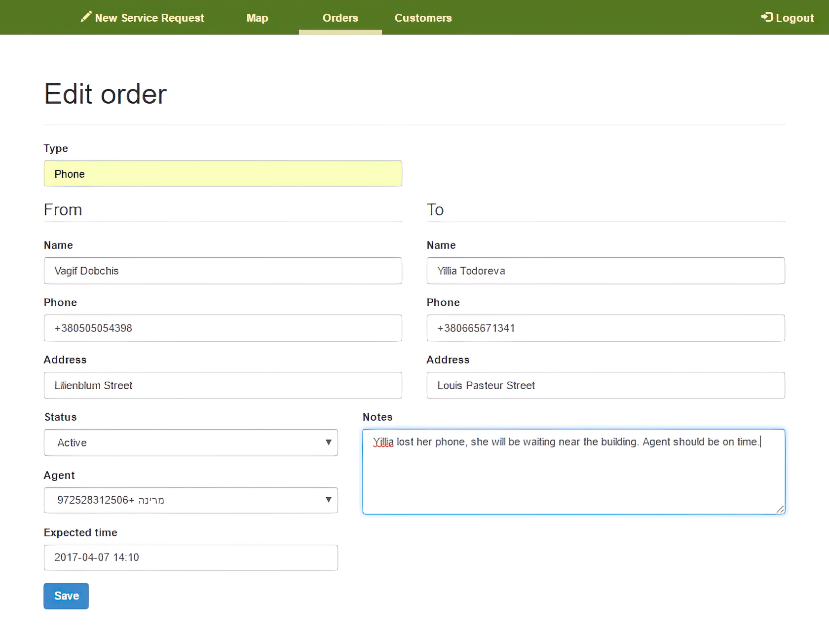
order creation page

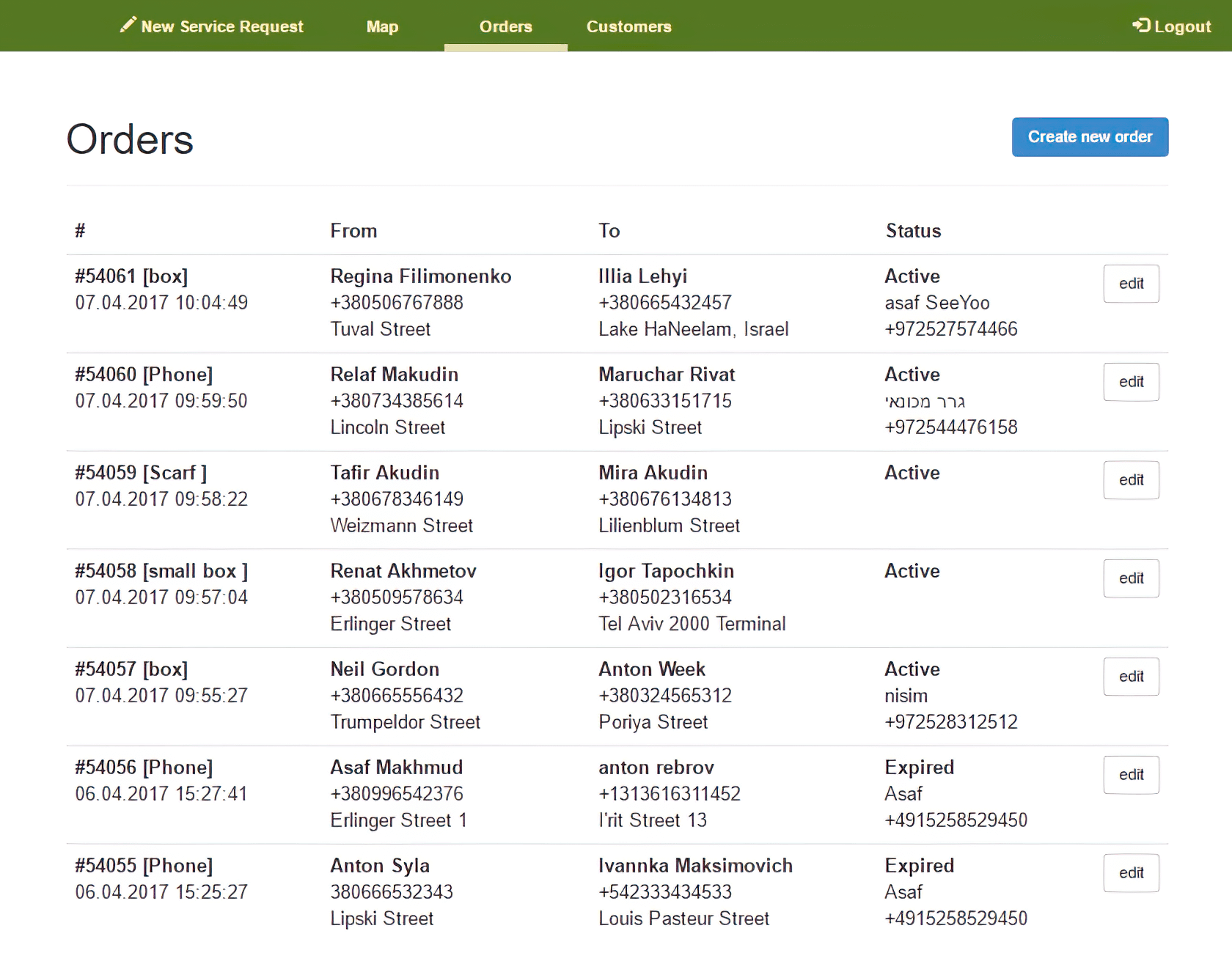
order list page
After we created MVP with main functionality and discussed it with the customer, we continued to work on usability. We found that managers performed different types of search often during our customer interaction scenarios explorations. That’s why we designed the main screen in a way where various entities can be searched via one uber-input field. This universal search field was able to find all entity types that existed in this CRM — addresses, users, products.
The most frequent operation in manager’s working process was courier’s assignment on order. It occurred many times per day; that’s why we created drag-and-drop functionality so managers can drag an order to a courier directly on the map.
Then we created type hints for frequent addresses in all the input fields and a system that allowed to offer the most frequently used customers and addresses to speed up operators’ work.
SeeYou was an interesting project in terms of development planning. We managed to create extensive project description in advance, and we stuck to it all the way through. We’ve got a unique experience, taking into account the fact that we are mainly engaged in Agile development.